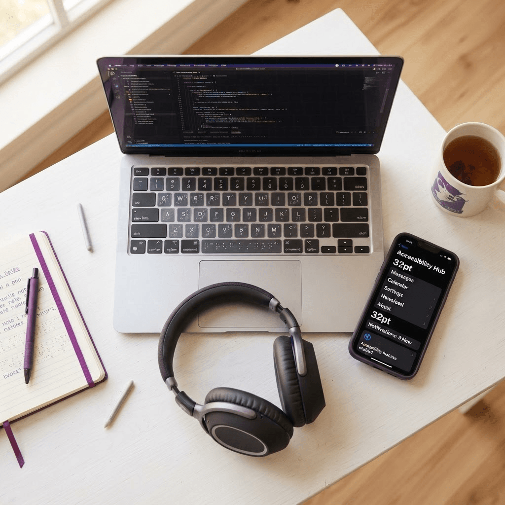
Building an Accessible Digital Platform: What We Changed and Why It Matters
Digital inclusion is not optional. We recently completed a significant accessibility overhaul of the innerX platform — here is an honest account of what we changed, why each change matters, and what it means for every person who uses our app.
Roughly one in six people worldwide lives with some form of disability. That is more than one billion people who rely — to varying degrees — on assistive technologies, keyboard navigation, and carefully structured digital interfaces to get things done online. When a platform is not accessible, it does not just inconvenience those users; it excludes them entirely.
At innerX, our mission is to help everyone unlock their inner expert and lead a more fulfilling life. That mission cannot be genuine if our platform only works well for users without disabilities. So we conducted a thorough accessibility audit against the Web Content Accessibility Guidelines (WCAG) 2.2 at Level AA and implemented a series of improvements. This article explains exactly what we changed and the real-world benefit each change provides.
1. Skip to Main Content — Saving Hundreds of Keystrokes
We added a 'Skip to main content' link as the very first focusable element on every page. It is visually hidden until a keyboard user presses Tab, at which point it slides into view at the top of the screen. Activating it jumps focus directly past the navigation menu to the main page content.
This addresses WCAG Success Criterion 2.4.1 (Bypass Blocks). Without it, a keyboard or screen reader user must Tab through every navigation link — potentially eight or more items — before reaching the content they came for, on every single page visit. For a user relying on a switch device, a sip-and-puff controller, or a screen reader, that friction multiplies quickly into a genuinely exhausting experience.
2. A Global Keyboard Focus Ring — No Element Left Behind
We implemented a site-wide focus indicator using CSS :focus-visible. A clear 2-pixel purple ring — drawn in the innerX brand colour — appears around every focused interactive element: navigation links, buttons, form inputs, and dropdown items. Critically, the ring only appears for keyboard and assistive-technology navigation. Mouse and touch users do not see it, so the visual design remains clean.
This satisfies WCAG 2.4.7 (Focus Visible) and the newer, stricter 2.4.11 (Minimum Focus Appearance) introduced in WCAG 2.2. Many websites still rely on browser default focus outlines, which Chrome and Safari have quietly weakened over the years. By defining our own ring with sufficient contrast and size, we guarantee users can always see where focus is — regardless of which browser they use.
3. ARIA-Expanded, ARIA-Haspopup, and Role='Menu' — Making Dropdowns Legible to Screen Readers
The Login dropdown in the main navigation looks simple visually — a button that reveals two options. But without proper ARIA attributes, a screen reader user hears only a button with no indication that it controls a menu, and no announcement when the menu opens or closes.
We added aria-expanded to the button so it announces 'expanded' or 'collapsed' as the state changes. We added aria-haspopup='true' to signal that the button opens a menu widget. We linked the button to the menu container via aria-controls and gave the container role='menu'. The decorative chevron icon was marked aria-hidden='true' so screen readers do not announce 'image' or 'chevron down' as part of the button label.
This implements WCAG 4.1.2 (Name, Role, Value), which requires that all user interface components expose their name, role, and current state to assistive technologies. Without it, screen reader users cannot tell whether the menu is open, cannot find the options, and cannot reliably operate the control.
4. Mobile Menu Accessibility — The Hamburger Button
The hamburger icon button on mobile received the same treatment. Its aria-label now dynamically switches between 'Open navigation menu' and 'Close navigation menu' based on the current state, and aria-expanded reflects the open/closed state. The icon itself is aria-hidden. The mobile navigation panel is linked via aria-controls.
This matters because mobile screen reader users — who represent a large share of all assistive technology users — navigate by touch gestures, not by visual scanning. A screen reader that announces only 'button' for the hamburger icon gives the user no actionable information. The updated markup tells them precisely what the button does and whether the menu is currently open.
5. Live Regions — The Rotating Tagline and Error Messages
Two distinct 'live region' improvements were made. First, the rotating tagline in the header — which cycles through phrases like 'Unlock your inner potential' — now carries aria-live='polite' and aria-atomic='true'. Screen readers will announce each new phrase as it appears, without interrupting whatever the user is currently reading. Non-visible phrases are marked aria-hidden='true' to prevent duplicate announcements.
Second, form error messages in the registration flow now use aria-live='assertive'. When a user submits a form with an invalid entry, the error message is announced immediately — without requiring the user to move focus — so they know exactly what went wrong and what to fix. This implements WCAG 4.1.3 (Status Messages) and prevents the silent failure state that many users with visual impairments previously experienced.
6. Form Inputs — aria-describedby, aria-invalid, and inputMode
Each input in the registration and verification forms is now linked to its associated error message via aria-describedby. When an error exists, the input also receives aria-invalid='true'. Together, these attributes mean a screen reader user hears the input label, the input's current value, its invalid state, and the specific error message — all in one pass, without any extra navigation.
The six-digit verification code input also received inputMode='numeric' and autoComplete='one-time-code'. On mobile, inputMode='numeric' triggers the numeric keypad rather than the full keyboard — a benefit for all users, not just those with disabilities. The autoComplete attribute allows password managers and iOS/Android to auto-fill SMS verification codes, removing a manual step that disproportionately affects users with motor impairments.
7. ARIA Landmarks and Navigation Labels
The main desktop navigation now has aria-label='Main navigation' and the mobile navigation panel carries aria-label='Mobile navigation'. These labels allow screen reader users to quickly identify and jump between landmark regions using their screen reader's landmark navigation shortcut — one of the fastest ways to move around a page without reading every word.
What This Means in Practice
Collectively, these changes mean that innerX is now meaningfully usable by people who navigate by keyboard, people who use screen readers such as NVDA, JAWS, VoiceOver, and TalkBack, people who use switch access or other adaptive input devices, and people who rely on browser zoom and larger text sizes. We did not add these features as a compliance checkbox. We added them because the people they benefit are exactly the people our platform was built to serve.
Our Ongoing Commitment
Accessibility is not a project with a finish line — it is an ongoing practice. We conduct regular reviews, test with real assistive technologies, and welcome feedback from our community. If you encounter any barrier while using innerX, please email us at support@innerx.ai. Accessibility reports receive the same priority as functional bugs in our development workflow.
You can read our full Accessibility Statement at innerx.ai/accessibility and explore the Accessibility section of our FAQ at innerx.ai/faqs for answers to common questions about keyboard navigation, screen reader support, and how to report issues.